

It didn't help that the greaves made me think of cargo shorts and skater shoes. Those Reivers would love to help purge the galaxy of xenos, but sorry, they're too busy doing radical tricks in the nearest halfpipe.
It was only when the rest of the Phobos stuff dropped that my attitude started to soften. Ohhhhh, they're stealth troops, they've just been painted in bright colours because Flames Orkshop.
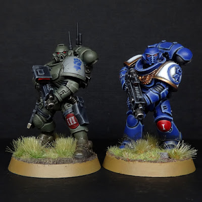
I started to imagine how these tacticool idiots would look if painted in more drab colours, and I liked what I was imagining. So much so, in fact, that I recently bought a box, built 5 Incursors (albeit without the Geordi LaCyclops visors) and painted up a test model.
Bit sneakier, huh? I'm not claiming I'm being original here; I've seen other people do it as well. I just had fun adapting the insignia established on the rest of my army and muting it somewhat. Arguably the big blue fist is still a reach, as is having any metal surfaces, but gimme a break. I'm trying to strike a balance between "sensible" and "looks good on the table."
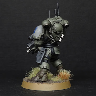
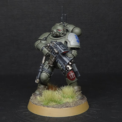
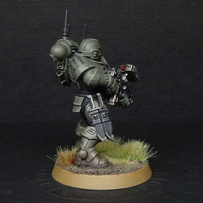
The chapter badge background has been shifted from white to mid-grey, the bright company kneepad knocked back to a darker tone, and the squad markings on the right pauldron just became black numerals. I also avoided having any glowing lights anywhere; the eye lenses and big honkin' gun sights are both red glass instead.
The red knee pad means he's from the 3rd company, just like the rest of my Cobalt Scions army so far, and the number 3 is his squad number. Primaris marines can switch armour between deployments, although I imagine the 10th Company Vanguard are the Chapter's stealth specialists and really don't leave home in anything other than Phobos plate.
If you're curious, here's the step-by-step:
- Prime spray Mechancicus Standard Grey
- Basecoat Vallejo German Fieldgrey WWII (model colour no. 70.830)
- Basecoat black areas Citadel Contrast Black Templar
- Basecoat black areas Citadel Corvus Black (including squad number on right pauldron)
- Highlight black areas Citadel Eshin Grey
- Edge highlight black areas Citadel Dawnstone
- Dot highlight black areas Citadel Administratum Grey
- Recess shade/line in black areas with Citadel Contrast Black Templar
- Basecoat left pauldron Citadel Dawnstone
- Paint chapter icon with Citadel Macragge Blue
- Basecoat metal areas with Army Painter Gunmetal
- Shade metal areas with Citadel Agrax Earthshade
- Shade metal areas with Citadel Nuln Oil Gloss
- Highlight metal areas with Army Painter Shining Silver
- Basecoat left kneepad with Army Painter Chaotic Red
- Highlight left kneepad with Citadel Mephiston Red
- Add squad number to left kneepad with Citadel Dawnstone
- Black out lenses with Citadel Corvus Black
- Highlight lenses with Citadel Evil Sunz Scarlet
- Edge highlight lenses with Citadel Wild Rider Red
- Glaze lenses with Army Painter Chaotic Red
- Add white dot to eye lenses if desired
- Gloss varnish lenses
- Highlight and add chipping to armour with Vallejo Green Grey (model colour no. 70.886)
- Line in recesses of armour and chipping with Reaper's Brown Liner
- Add Army Painter Gunmetal to centre of particularly big areas of chipping
- Add Citadel Typhus Corrosion to boots/ankles
- Base with Citadel Stirland Battlemire texture paint
- Drybrush & rim base with Vallejo Game Colour Earth
- Drybrush base with Army Painter Skeleton Bone
- It's flockin time.
I think I went overboard on the chipping, but otherwise I'm pretty happy with how this looks. Now to paint the other 4 so he can get on a table and be... marginally less effective than my other troops units, but way more tacticool. And radical.
This tester turned out quite nicely, and I think it works as a "realistic" color scheme for the CS.
ReplyDeleteI still reserve the right to be annoyed about "sneaky" power armor though. ;)
Thanks mate! Yeah I don't care how muffled the sound of their joints and power units are, anyone who weighs that much will struggle to be quiet when moving.
DeleteI painted the layers under their pauldrons to look like rubber to further emphasise the muffling side of things, but IF these guys are stealthy it's by use of cover, darkness, slow movement and camo rather than some sort of D&D-esque stealth run :P
TBF I guess that's generally true of almost all stealth anyway?
For me it is mostly about how wearing shorts somehow makes it stealth. Still power armor, still a 3+ save, and yet the shin guards make all the difference ;)
DeleteThe old scouts made a lot more sense.
I got a lot more rant in me about tacticool, bespoke bolters, magic backpacks, scary face masks, special psykers and more, but lets leave it at that.
Lol fair. Yeah I don't think 40k has the resolution to handle the difference between tacticus and Phobos plate, but rest assured when I wrote the rules for primaris stuff in Deathwatch roleplay I gave Phobos armour 20% lower protection and higher stealth than full battle plate.
DeleteIt'd be kinda cool if Phobos just got a 4+ save in 40k, but somehow that feels like a big difference given the proliferation of AP-1. But I'll stop there in the hopes I don't trigger a full blown rant from you. I quite agree there's plenty about Phobos stuff that's pretty silly XD
The green must have affected the marine, he's carrying two knifes around so that he can krump fasta'!
ReplyDeleteOn a more seriuos note; neat colour scheme!
Yep, you know the old saying: two knives are better than one! :P
DeleteTo be fair if they're using those knives a lot, the edges will get ruined pretty quickly, so having a backup would actually be useful.
I get the feeling that they would be stealthy enough to move into an ambushing position, using ambient noise and sentry's potential inattention to get close enough to where they can rely on their drab concealing colours to hide them. And then who cares how stealthy you are when everyone's dead from mass bolt rifle fire lol!
ReplyDeleteYeah that's how I imagine it too :)
DeleteNice work, mate! I had similar thoughts when painting my Dark Angels Infiltrators, and opted for a dark grey urban scheme. I think the older I get the more content I am for my forces to be less unified in their appearance.
ReplyDeleteI imagine dark grey urban dudes looked glorious 🤘
DeleteAgreed about non-uniform forces; when it's done right it really adds to the army, since you see the same thing with real armies (e.g. the green British Rifles regiment alongside the red coats in the Napoleonic wars).
Back in the mid-90’s this was exactly how I thought most Space Marines *should* look. I thought all the crazy-bright colors were wildly impractical. I didn’t have the years of painting knowledge to give me the confidence to try it from the get-go, so I went with Dark Angels and painted their guns and squad markings in black. Love what you did hear and I totally agree about Phobos armor looking like cargo shorts and sneakers. Too funny.
ReplyDeleteIt's ironic that the original Rogue Trader showed all those alternate camo schemes, with the main heraldry being for parade only, and even by 2nd edition people stuck very much to purely parade colours.
DeletePersonally I love having the option to do both these days. Phobos for actual sneaking, then brightly coloured armour for being highly visible, enemy-morale-draining, friendly-troop-inspiring shock troops that say "by all means, feel free to fire your lasgun at me."