

In the last dying gasps of 2021 we were all virtually sitting around our discord and musing that it would be nice to do one of those "new year, new army" deals. Fresh from painting a horde of Chaos and a huge whack of Genestealer Cults you'd think I'd be in the mood for something friendlier. Something light and fluffy perhaps?
Nahhhhh! I'm having way too much fun being evil at the moment to go good-guy so soon. Time to double down on the evil and go the the nastiest faction (citation needed) in the 41st millenium: The Drukhari. I'd loved the range since the moment it was released and knew that one day they would be mine. I just couldn't figure a paint scheme that I liked...

Then I remembered that Charlie had speed painted a unit of Drukhari in, like, an evening. And that was Charlie managing that in an evening. Plus they looked good. After winkling out his secrets (more on that later) I now had an idea of the look. But there were still some other ideas pulling at me for this new army. That is, until I checked the contents of the combat patrol box and found that two of them was near as damnit exactly a thousand points. Cue me windmill slamming the buy button and the gates of Comorragh gaping wide to render unto me a small host of very naughty boys and girls.

Now then, to those Charlie painting secrets. Well, a bit like The Graduate I have one word for you kid... Inks. The wonderful, beetle-esque armour is, without a doubt, the easiest scheme I've painted in years. The process goes like this: Prime black. Drybrush through a range of metallic steel shades from AP Gunmetal with a bit of black thrown in all the way up to Vallejo Air Steel which is the brightest metal I own. Each layer goes on a little lighter so there's less and less picked up on each pass. Four drybrush layers in total. Might sound a lot but it takes maybe a quarter hour for the entire unit. Next, grab your ink of choice. And yes, I said ink, not wash or contrast paint or whatever. Those are totally fine options but have their own properties that will mess with the effect or dull the metal. There are a rare few transparent paints that do the job (more on that when we hit Wych O'Clock) but for the most part it's inks you want. In my case Liquitex Phthalocyanine Green. It's the name of a pigment apparently. Le shrug. Two layers of that - watch out for pooling - with drying time in between gets you a gorgeous veridian green. Slap a layer of satin varnish to protect the finish (inks are not terribly durable and tend to be water soluble) and Robert is your father's brother.
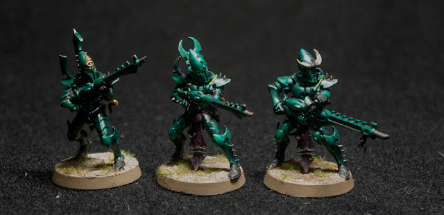 |
| These models are a sod to photograph well. |
After that I just picked out the bodysuits in black, the dangly bits in Barak Nar Burgandy and a few choice details in brass. Anything that was clearly leathery - pouches, scabbards, etc - was picked out in German Camo Black-Brown to keep the black tone but break up the regions of black. Finally the drug tubes and eyes were picked out in white and then glazed with Tesseract Glow which gave a nice pop of intense colour to the overall feel.

Speaking of intense colour: I was musing on hair colours, every natural shade I imagined just looked wrong somehow. So I leaned waaay into the cyberpunk and decided that everyone would have bright dyed hair. It works surprisingly well and is more intense in the flesh but I was fighting my camera to make it resolve the armour colour.

One of the nice things about getting a combat patrol box is a mix of bits. I was quite taken with the Ynnari heads in the Incubi box and so used a few of them on my warriors. In the first bit of lore for the as yet unnamed army I decided that the deep scars were an affectation of the warband. They're from the Kabal of the Flayed Skull you see and sometimes, you just have to practice what you preach and carve your skin down to the living bone for cosmetic reasons. Oh and because you are an evil mentalist Drukhari of course.
There'll be plenty more where these came from (who knows I might even get the photography right) so I'll leave any more musings on painting, army composition and lore for then. Wouldn't want you to get bored now would we? Until then, lovely people
TTFN
Looks great! I think the armour being very cohesive and a strong look helps you get away with mismatching hair clours and keep them looking like units.
ReplyDeleteThanks RSF_Angel! That was my hope too. Glad it seems to be working out
Delete